Archive: ‘random thoughts’


a photo a day… 31 dec ’12

Monday, December 31st, 2012

today marks the end of my leap year in iPhone “polaroid” pictures. i hope you have enjoyed it, and maybe been inspired to do something similar yourself?

here’s my top 3 insights that i gained while doing this project:

(1) there is always something worthwhile to make a picture of. just be still for a minute and you will see. but don’t force it… you don’t have to photograph everything!

(2a) any camera is better than no camera. precious memories can be hidden in “bad” pictures. so don’t make excuses, make photographs.
(2b) but: the more versatile the camera, the less limitations are imposed on your creativity. so if you love photos, get the best camera you can realistically afford, and learn to use it properly.

(3) a year seems long on paper… but it’s not. time goes really fast, so don’t muck about. you know there are things you’ve been putting off… well, what are you waiting for?

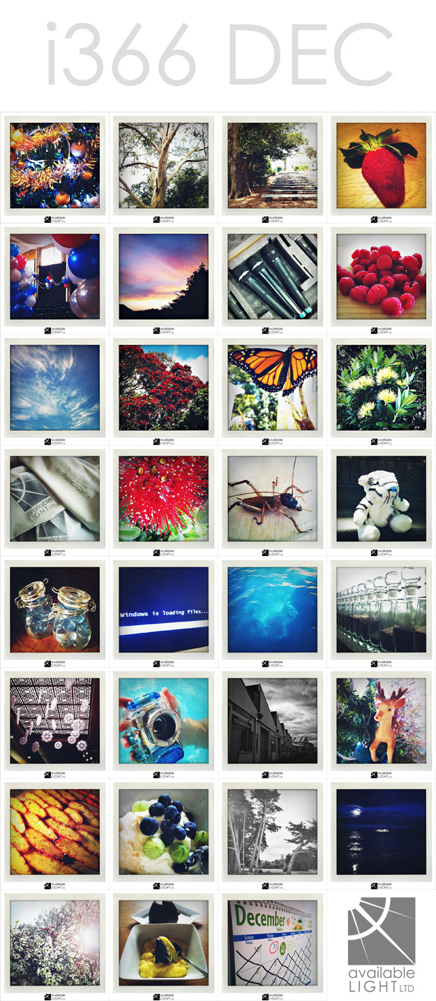
december’s photo-a-day collage:
auckland lifestyle photographer

VIEW ALL PHOTOS ON FACEBOOK…
i366 january to june
i366 july to december
thanks for following along!

a photo a day… 30 nov ’12

Friday, November 30th, 2012

here’s the i366 album from january to june: i366 part 1 on facebook

and here’s the new album which will cover the rest of the year: i366 part 2 on facebook

feel free to subscribe/like and follow along 🙂

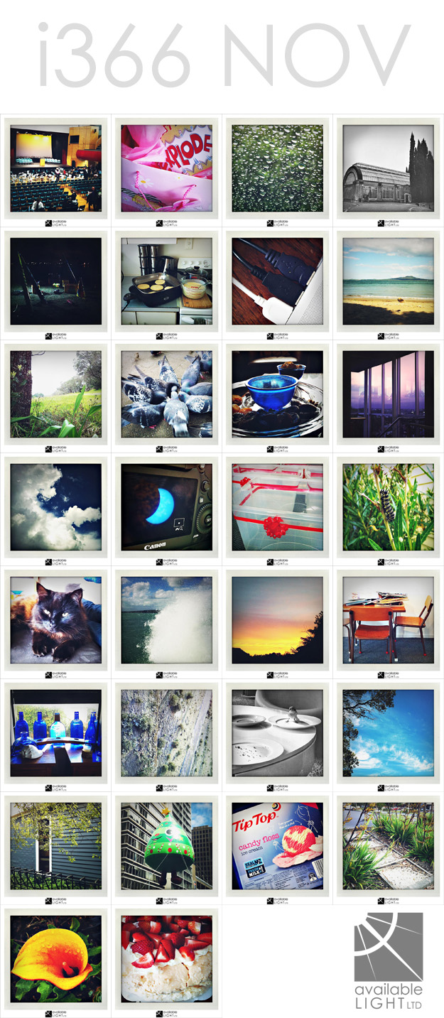
november’s photo-a-day collage:

auckland lifestyle photographer

it’s a grey area… 28 nov ’12

Wednesday, November 28th, 2012

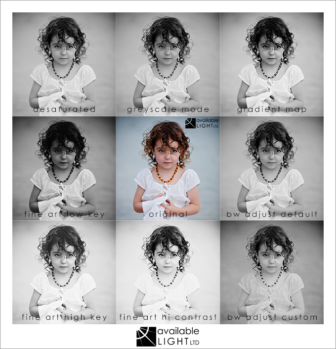
when a person thinks they have no options, they say, “it’s black & white”. but in photography, that couldn’t be further from the truth. not all black & white images are created equal! the name suggests that the image will contain true black and pure white – yet most simple conversion methods produce dull images made up of grey, grey and grey (i refuse to reference 50 shades, haha). To demonstrate this, here are some sample conversions:

(click this image for a larger-size popup)

auckland lifestyle photographer

some of these methods produce pleasing and dynamically rich images with impact and mood, while others deliver a muddy and tonally dull version which detracts from the subject and is visually boring. and some go a little overboard! lol

developing a pleasing black and white image from a colour original takes a measure of artistic skill to ensure the result has a good mix of tones and the treatment suits the subject matter. some images look their best with a strong contrasty mix, and others are enhanced with a soft blend across a narrow range of tones. a technically good colour image can be totally ruined by an inappropriate or unskilled conversion – which is why i provide complimentary hand-adjusted black & white versions of every digital image purchased, so that my clients’ images will always look their best whether they display a colour version or a monochrome one.

if you are a photographer or hobbyist and you are interested in learning how to improve your black & white image processing, feel free to enquire about my photoshop and lightroom tuition 🙂


subscribe  |  all site content © 2020 available light ltd  |   powered by WordPress  |  Blog Theme based on LJP & SLR Lounge