Archive: ‘random thoughts’


working with pocket-camera photos… 12 jan ’10

Tuesday, January 12th, 2010

today while out visiting, i was asked to take a quick portrait of a friend, but i only had my compact Canon IXUS camera with me. now this isn’t a bad little camera for your purse… but when it comes to quality work, it doesn’t really cut it. sometimes this happens, and you have to grab a nice-looking photograph with whatever you have to hand:

here’s how i did it…

first of all, i needed to use the best light possible for the shot, so i took Norm (the subject) outside to an area of open shade, with good reflected light from the sunlit lawn. then i faced him at an angle to the camera, and had him turn his head towards me a little more, to create interest and present a flattering view.

unlike my DSLR cameras, my IXUS has no manual shooting controls; but it does have a 3x optical zoom (max focal length approx equal to 105mm on a 35mm camera). to avoid unflattering barrel distortion (seen with wide-angle photos, makes you look like… well, a barrel), i chose to zoom the lens in as far as it would go, and step well back to compose the shot. this also solved the problem of my reflection appearing in the subject’s glasses!

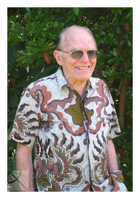
while i chatted a little to Norm to put him off-guard (as this impromptu photo shoot was not his own idea!) i composed and pre-focused the camera – important with compacts as they have a noticeable shutter delay – and when i saw a natural smile i grabbed the shot. i took a few shots to make sure of getting one that he would be happy with… and this was his favourite. so now i had the photo, and here’s what came out of the camera:

unfortunately, the result looks like what it is – a compact camera snapshot. so here’s what i did to make it more presentable (sorry but here i’m gonna assume a good working knowledge of Adobe Photoshop – plenty of other places cover the basics much better than i can in this blog).

first of all, i ran ‘Pro Retouch’ on it (from Totally Rad Actions) and gently softened areas of the skin with a low-opacity brush. then i used the ‘Eye Bump’ layer from that same action, and slightly lightened the tinted glasses to reveal his eyes, and painted briefly over his teeth as well. then, i used the Colour Balance tool and adjusted the warmth of the photo by increasing cool green, blue and cyan tint on the tree behind Norm (leaving Norm his original colour with the history brush). i used the Curves tool and gave the photo a little more contrast and clarity overall. then, another action from Totally Rad, this time from their second set The Revenge: ‘Pool Party’, at just 20% opacity – and only applied to Norm himself (using layer masks), to remove some of the redness created by the camera, and even out his skin tones. and i added a light vignette to direct the eye to his face. here is the photo so far – looking a lot better, but still not done.

next, i needed to give Norm more separation from the background… with no control over aperture i was unable to shoot the way i normally would with my ‘wide-open’ lenses; and this put the whole photo into focus – fine for landscapes, but distracting for portraits. so i duplicated the whole layer, and ran the Extract filter on the top layer to manually erase the entire background. this is a fiddly job especially where fine hairs exist – if you erase them too, you end up with a cardboard cutout. the Extract filter often doesn’t do a very good job but this time it was acceptable with a bit of tweaking. then, on the underneath layer i ran ‘Bokeh’, a filter from Alien Skin which approximates the effect of wide aperture lenses. i experimented with the settings until the preview looked reasonably natural, and then applied the filter. this put the leaves out of focus – but of course it blurred Norm too and made his shape bigger than it was before, so that it showed up as a fuzzy pink glow all the way around his outline. and here’s what that looks like:

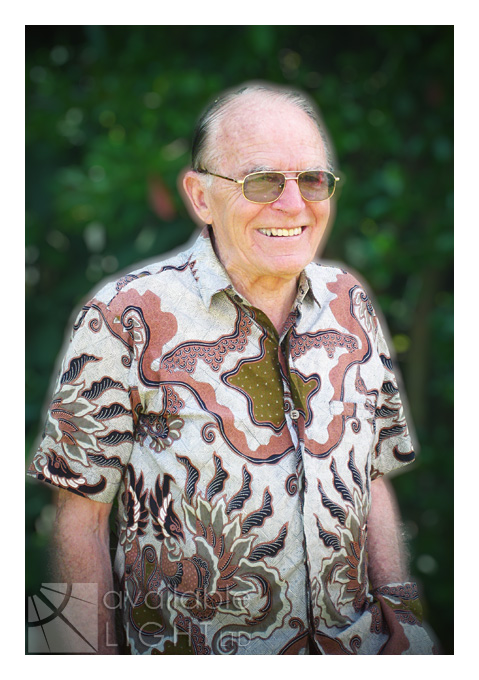
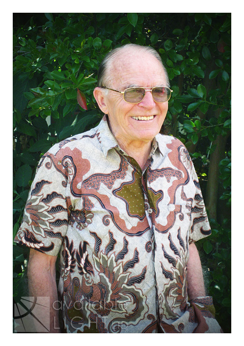
yeh, not good LOL. to fix that, i enlarged the leafy area on the bottom layer all the way around Norm to reduce the size of the glow; now the upper layer would hide it. a couple of tweaks (like removing the red reflection from the left of his glasses) – and i’m done. and here is the before and after shot together for comparison:

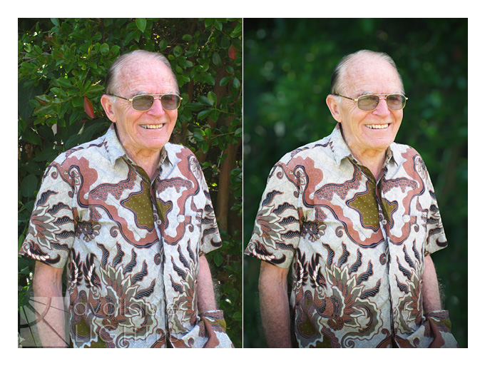
this method will never produce as good a result as using the proper equipment from the start – but it can help rescue a situation where sometimes a snapshot is all you have to work with, and you’ve just got to do your best. if you have any questions please feel free to comment 🙂

straight from the duck’s, uh, beak… 8 jan ’10

Friday, January 8th, 2010

what the duck is a clever and insightful look into the world of “anyphotographer” (yes, i meant to write it that way). one that arrived in my rss reader this week has inspired to retrieve and share some of my all-time personal favourites here. these simple comic strips artfully describe in approximately 3 frames certain common frustrations that almost every photographer can relate to – and all other humans get to point and laugh, so it’s win/win!

“never work with children or animals” was famously coined by WC Fields… that law still holds true today, for all but the most patient saints (and the feeble-minded):

this next “compliment” will be familiar to many photographers and others… a variation on the retort below is to invite yourself to a tasty meal at their home, and, after you have eaten your fill, comment on the obvious quality of their mixing bowls:

this is what we all wish we’d thought of doing when yet another person comes up and asks us to hand over portions of our livelihood for free:

actually, i am not an abstract photographer – but i believe frustration is a universally understood quality:

something a little more topical:

come on, admit it – you didn’t read the middle panel either!

warning: uncontrollable cringing and chronic eye tics may occur in anyone who has ever put themselves and their equipment through this experience:

to browse the entire collection at your own pace or purchase wtd merchandise, visit what the duck online

a handy spot? 6 jan ’10

Wednesday, January 6th, 2010

i am generally an organised person: i can locate any file on my computers within seconds; i have an appointment calendar and alarm clock, a filing and shelving system; and tidy house (mostly)… but as i type there is a spot right here beside me that gives lie to all my self-congratulation.

now, my desk is HUGE. it is a solid wood former bank manager’s desk i snapped up about 10 years ago from a used furniture depot, for just over $100. it is 1.6m long and nearly 1m deep, with tons of huge drawers and lots of leg-room underneath… in other words, there is plenty of space for storage, equpiment and work area without being cramped. yet seemingly without any conscious effort, the area directly in front of the printer (about 1 foot square) is permanently obscured by random bits & pieces that were cast aside and left behind; just like on the beach after a storm – but less smelly!

right now there’s a roll of duct tape, sunscreen, a pile of dvds, an empty glass, more dvds, empty dvd cases, a reel of fishing line (wtf? where did that come from, i don’t fish!), glue, receipts, bits of plastic sheeting, a tin of thread & needles, my water bottle, one of my cameras, a nail file, and TONS of notes on scrap paper. i’m not posting a photo because it’s too embarassing. i cleared all the junk away only a couple of days ago, but it has all returned once more, or taken other forms. this pattern repeats itself continuously no matter how i resolve to end the cycle. it’s like the cobweb that grows on your side mirror each night which you notice and remove on your drive to work each morning.

nowhere else in here accumulates such mess, (except periodically my kitchen bench, but that is all food-related); yet to my everlasting annoyance every time i need to print something i first have to schedule 15 minutes of cleanup time to make a space for the paper to exit the printer. (sometimes, i don’t even try… i just balance a piece of card over the top of the junk and under the printer, to catch the printed sheet and allow it to ride up and over the pile!)

am i alone? does anyone else have a similar high-tide point in their home, marking the exact spot at which your subconscious says “i’ve carried that far enough, it looks good here”? but why THAT spot? you know, it actually DOESN’T look good there. is there some kind of localised gravitational anomaly which causes things to increase in weight or awkwardness at those coordinates? or is it some psychic phenomena that causes me to just forget what i am carrying as i pass by? (don’t smirk – have you ever searched high and low for something you are actually holding in your hand?)

i have no way to test either theory so it looks like i will have to resign myself to living with the inconvenience indefinitely. and since no one needs to actually SEE my junk pile, here’s something far more attractive from a recent evening outing…


subscribe  |  all site content © 2020 available light ltd  |   powered by WordPress  |  Blog Theme based on LJP & SLR Lounge